How to Format a Book or Book Proposal…and Look Like a Pro Doing It
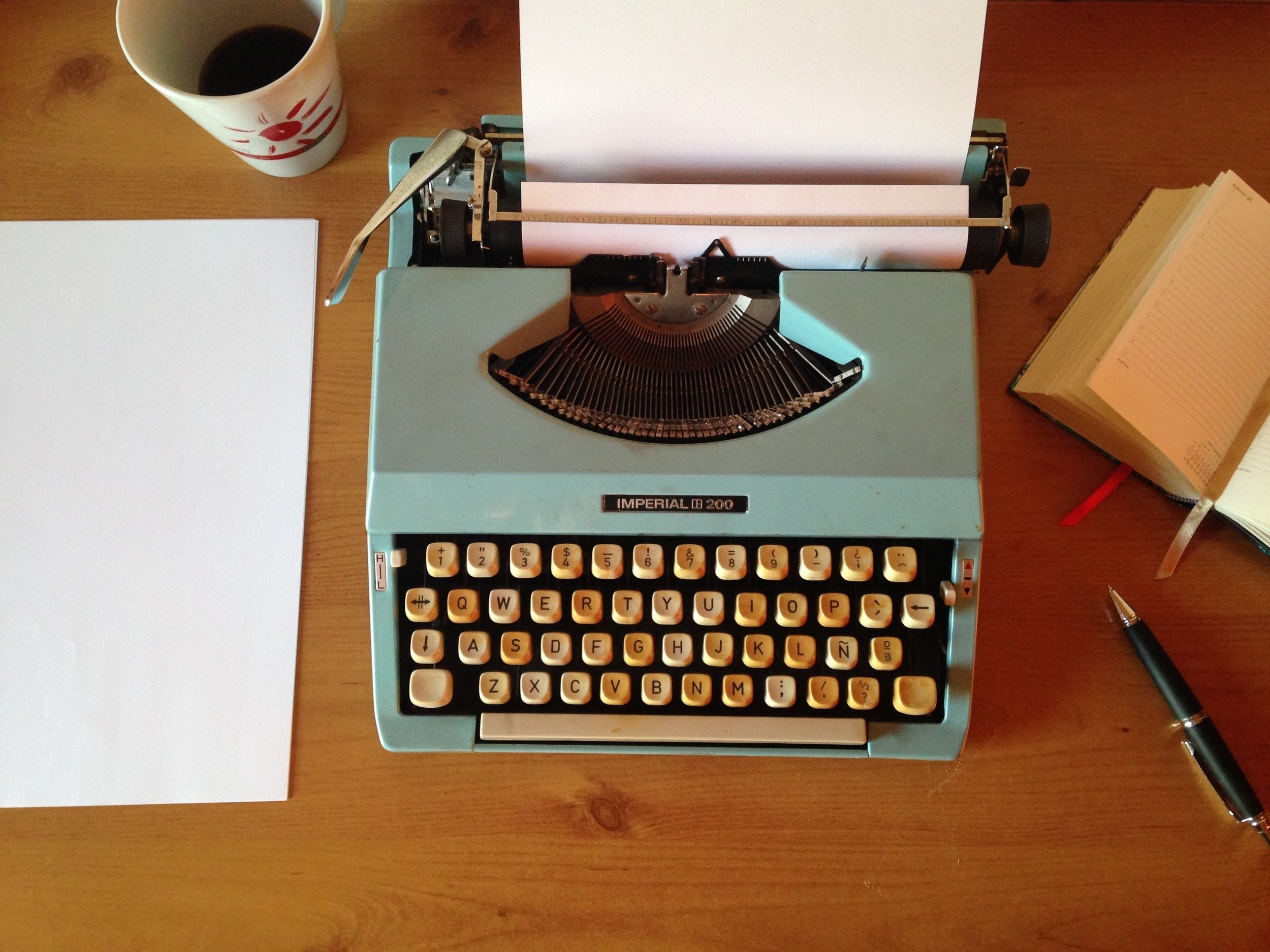
How to format your book or manuscript. Image of typewriter with blank paper.
Single space or double space? One or two spaces after a period? What font?
Your format actually depends on what you mean by “book,” so today I’ll go over formatting a manuscript for literary agents, formatting a book proposal, and formatting a finished book in order to self-publish. They each have different purposes and call for slightly different approaches.
First, no matter what I say here, always, always, always follow an agent or publisher’s guidelines. So if they say to use comic sans red font, do it. (Though actually you should run from someone who requests that!)
Formatting a complete manuscript for agents
It seems like you’d want it to look just like a book with drop caps and single spacing, but no. The goal is to make it easy for the agent to read and edit, which means it’ll look a little more like a college paper—boring, but functional. You want your book to stand out for its gripping writing, not for unorthodox formatting. For this, you want to look like all the other pro writers they work with.
Think term paper:
Times New Roman, 12 pt font, black
Double space
One space after a period (I know, I know. If you’re of a certain age, your typing teacher is rolling over in her grave.)
Numbered pages
Indented paragraphs with NO space between paragraphs. If you want to add emphasis or change topics or time frames, definitely go ahead and add an extra line between grafs to flag that. But only do this deliberately and sparingly so you don’t look like you’re writing a blog post or an email.
Do this:

Not this:

Unless someone requests a PDF or other file type, default to a Microsoft Word doc, which is still the gold standard. So if you’re using Google Docs, save as a Word doc.
You do not need to write Copyright anywhere on the manuscript and certainly not on every page. That is a dead giveaway that you’re an amateur. According to copyright law, you already own the copyright, and agents and publishers are not trying to steal people’s unpublished work. To make money from your book, they will need you out there publicizing it. And remember, they get infinitely more good manuscripts than they could ever publish. They don’t need to steal them.
What if an agent asks you to paste the entire manuscript into an online submission form or email?
Just do your best. As annoying as it is to submit this way, it can be easier for them to log and track submissions, and it may also help them stay safe from viruses.
Copy and paste from your original document, fix up anything glaringly weird at the beginning, and hope for the best. Rest assured that all the other submissions they get will also look weird, so they’ll expect irregularities.
Formatting a book proposal
A book proposal is a lot like a manuscript, but in addition to the sample chapters, it has a section that functions like a business plan, with an overview, author bio, audience analysis, comparative and competitive titles, marketing, publicity, and promotion. This section demonstrates how and why the publisher should take a risk on this book in the expectation of earning a profit. The only difference with format, is that you’ll treat the business section and the sample chapters differently.
Think business plan + term paper
For the sample chapters, use the same format I just recommended above (Times New Roman, 12 pt, double space etc.). Again, think term paper. The goal is to make it easy to read and edit, not to mimic a published book.
For the businessey parts of the proposal itself, use single spacing.
Include a title page with the name of the book, your name, and your address, phone, and email.
For the table of contents, if possible, link your page numbers so they’ll jump to the corresponding section of the proposal.
Formatting a book to self-publish
Unlike a manuscript you’re submitting, here you do want to mimic other published books. After you’ve edited your book within an inch of its life, I highly recommend you hire an interior designer. Sure you can upload it yourself in minutes, but it won’t look nearly as professional.
An experienced interior designer will make sure you don’t have orphans or widows or any other distracting page or line breaks. They’ll adjust the kerning and leading, and hopefully they’ll choose a pro-looking font, design a cool fleuron to open each chapter, and make sure your pagination is correct.
I recently read a fantastic self-published book on my kindle. It was extremely well written and edited. It was so good I ordered it in print as well. When the paperback arrived, it looked disappointingly amateur. I would not have bought this in a bookstore. The author had clearly spent the money on a great writing coach, editor, and copyeditor. But she seemed to have skimped on design and formatting. With ultra-bright white paper, a sans serif font, and spaces between every graf, it didn’t feel like a book or flow like a book. The design encouraged bite by bite consumption and jumping throughout the book, when I’m sure the author would rather her readers get so absorbed in the book they lose track of time or stay up late turning pages.
Blog posts are designed to skim and click through, but you want your readers to get lost in your book.
Think finished, traditionally published, printed book that you can hold in your hands:
To avoid looking looking like a blog, brochure, or a poorly self-published book:
Use a serif font. Serif fonts are the more decorative ones with strokes at the ends of the words. Like the headlines in this blog post. Sans serif, which doesn’t have strokes or flourishes on the letters, is what you see right here in the body of this post. Traditionally published books almost always use serif because it’s easier to read in print and helps you get into the flow of the story.
Single space.
Don’t put spaces between paragraphs unless you’re deliberately drawing emphasis or flagging a change of point of view, topic, or time period etc. Spaces between grafs will look like a blog …not a published book. They also make it harder for the reader to get into the flow of the story.
It’s your book, so you can use either one or two spaces after a period, though one space will look more modern. I don’t think the added spaces will bother readers as much as publishers.
Consider getting a blurb for your cover. This is absolutely not necessary, but it can help your design and give you credibility. There’s a lot of debate over whether blurbs actually sell books, and authors loathe having to ask for them, but when 90% of books in bookstores have them, your cover won’t look quite right without one.
What about word count?
I often get asked two things regarding word count.
1. How long should each chapter be? This doesn’t matter. Make it as long or as short as it needs to be. Some authors are known for chapters that only run 1-2 pages, while others write much longer.
2. How long should the book be? This does matter, and it often depends on your genre. I break this down in my post Word Count: Why Your Book Should Be This Long.